Harry Collins Athlete Development Case Study
Executive Summary
This brief aimed to build a service website to sell the services and knowledge of Harry Collins to athletes. The content was provided by the client as part of the brief with a short description of pages required and a colour scheme to be used throughout.
Research
Desk research was undertaken on other athlete development websites to judge design aspects, as the content was provided no content research or production was required.
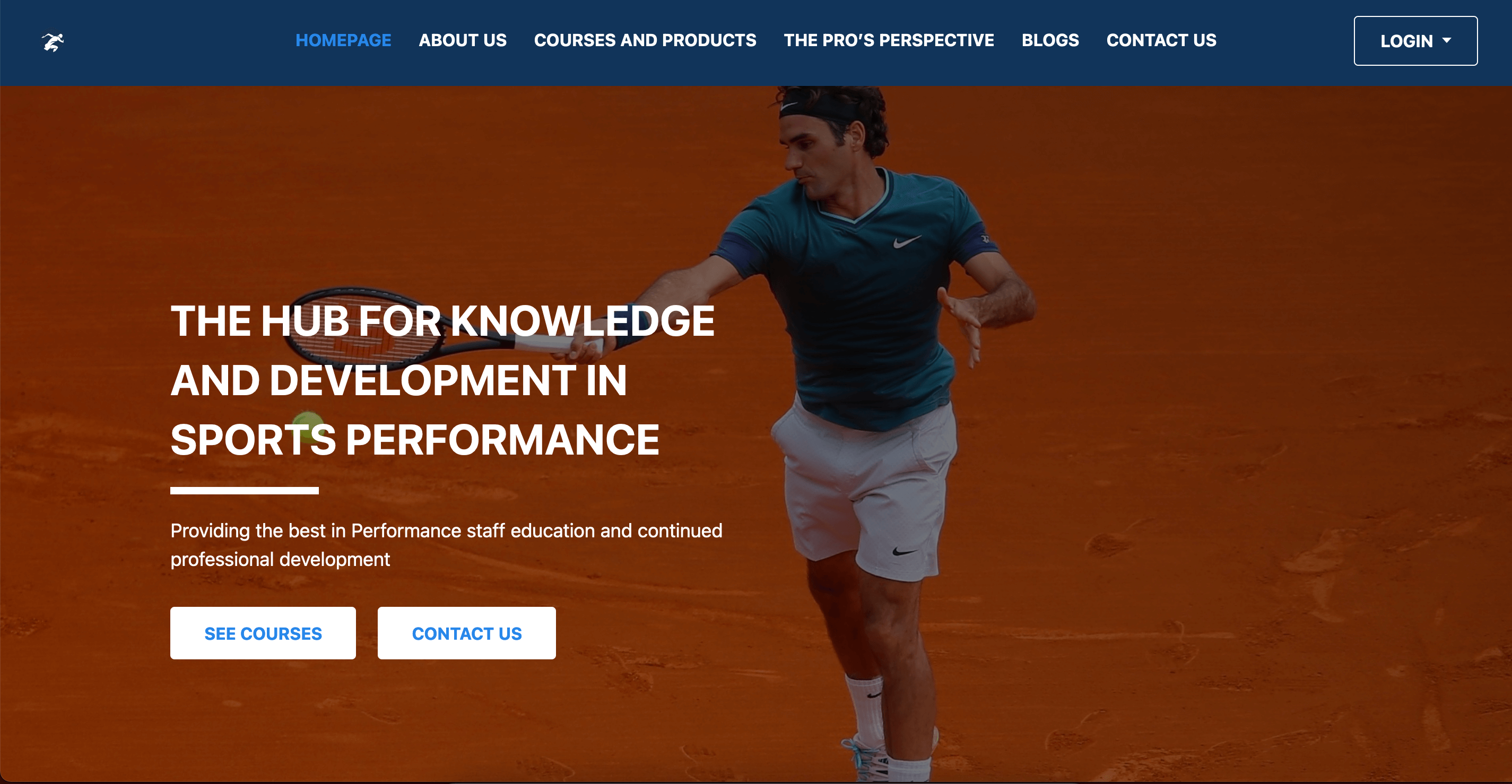
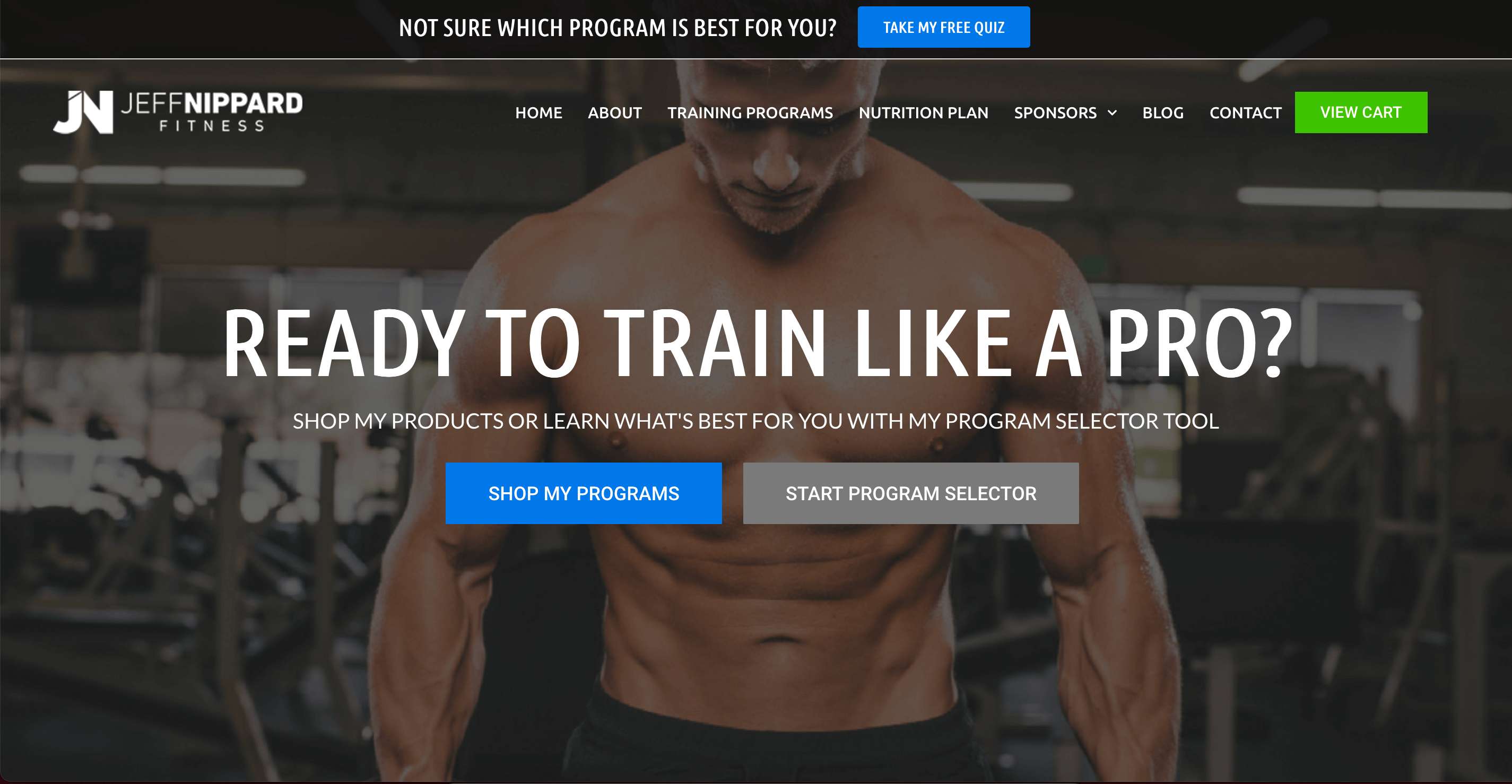
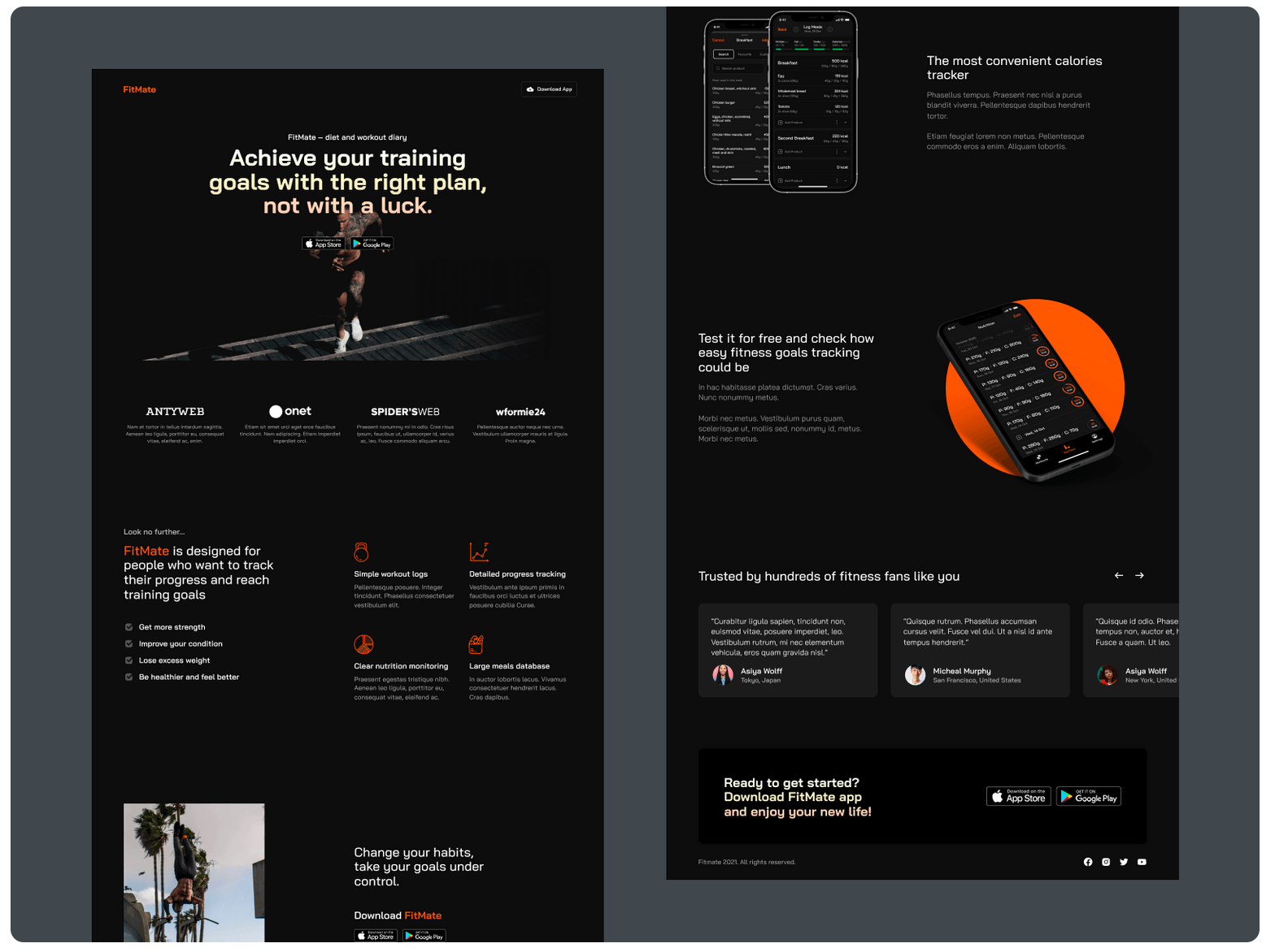
Three sites were looked at for design inspiration and motivation, theathletedp.com, jeffnippard.com and a design found on Dribbble.com. These sites can be seen in the images below:
Pre-design work
Before any design creation and iteration was undertaken the images provided by the client were all changed to jpeg files, to keep a consistent image format throughout the site. These images were then uploaded to tinyjpg.com to compress and optimise them, replacing the original images. This not only optimised the images for use throughout the site but also reduced the amount of data used in browsing the site.
All content provided by the client was also run through Grammarly to check for spelling and grammatical errors.
Design iteration stage
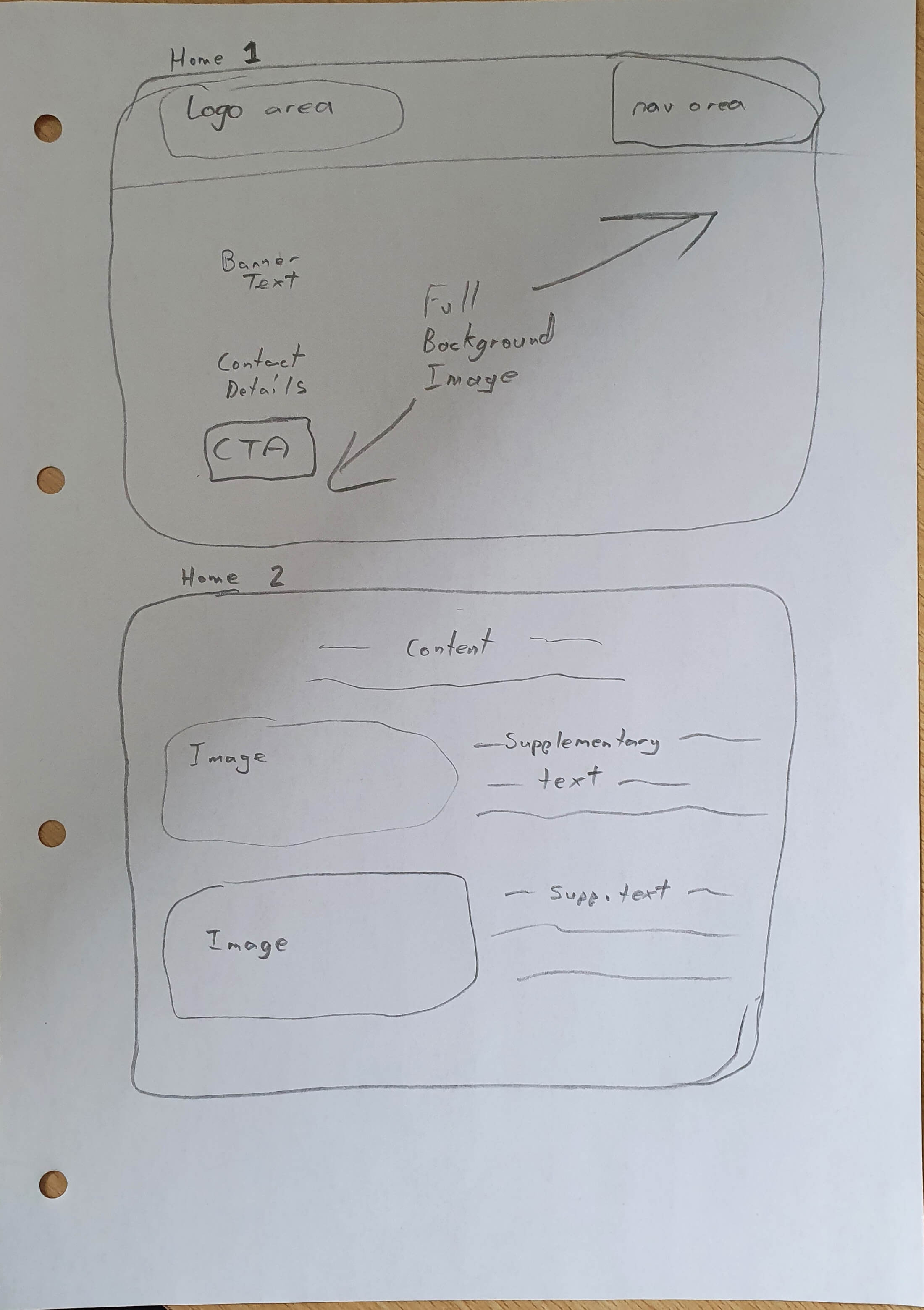
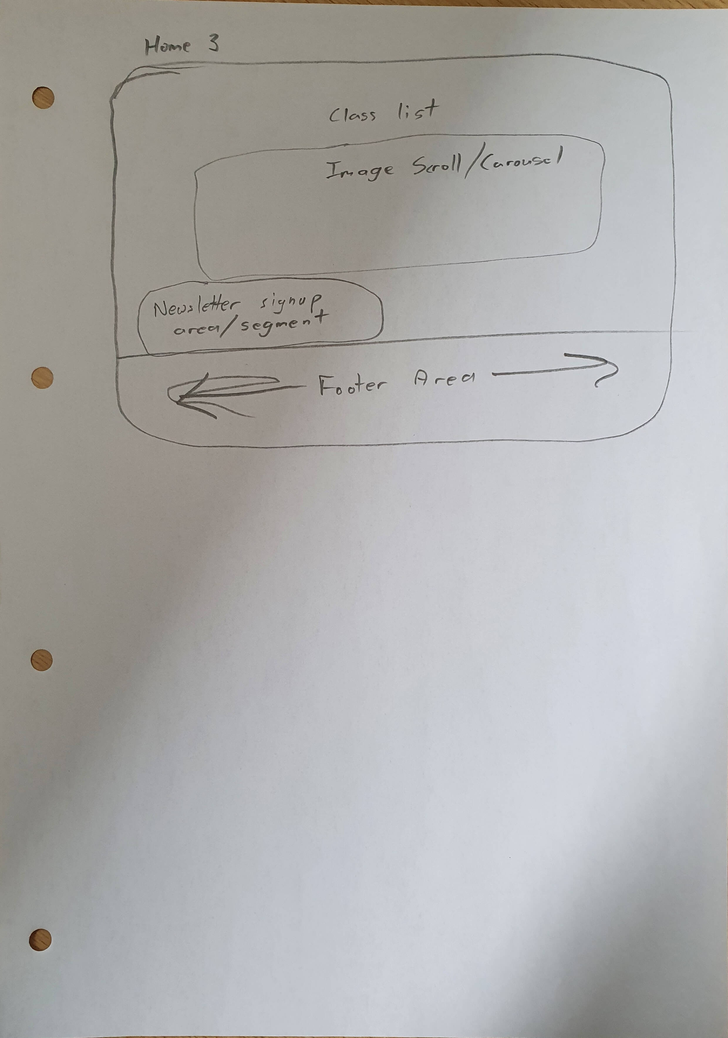
First paper mockups were produced to reflect a rough design of the site at this stage, these were informed from the previous desk research findings. A sample of the paper mockups can be seen in the images below:
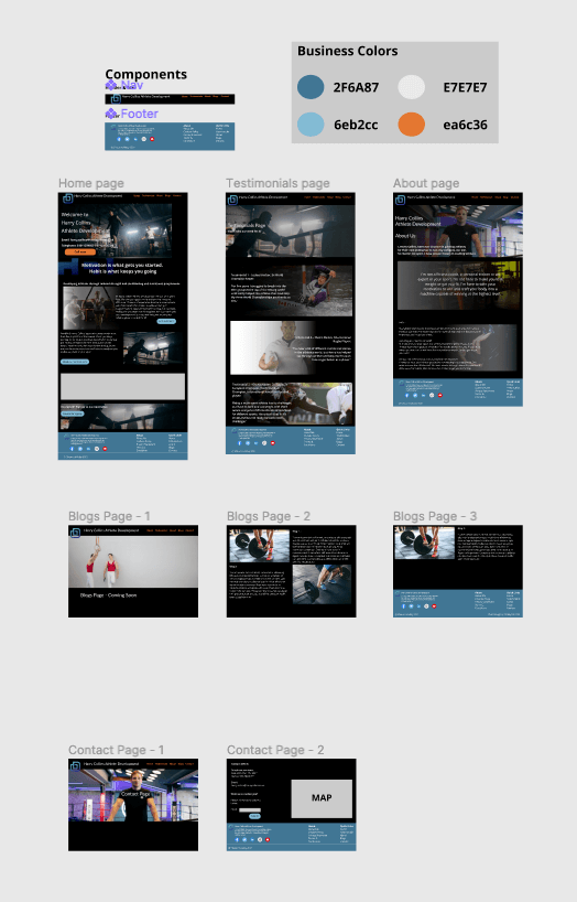
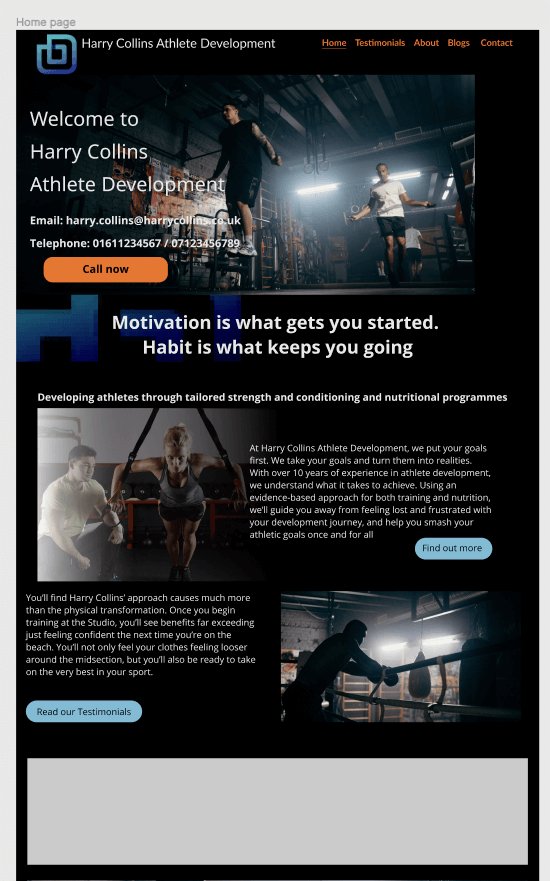
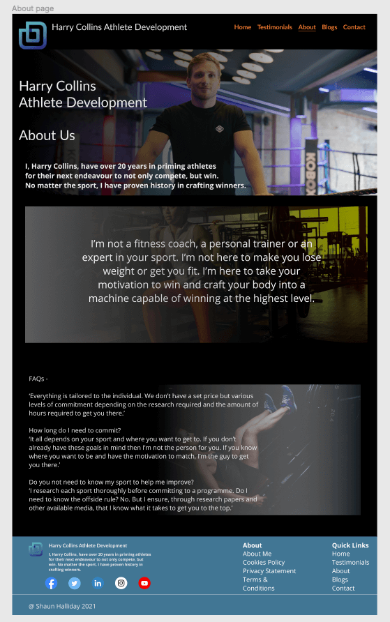
Next, these paper mockups were refined and improved upon by using Figma to produce high-fidelity mockups, an extra benefit of using Figma is that CSS properties can be pulled directly from the inspect tab, this helped with linear gradients and colour changes on images used in the site. Additionally, Zeplin was used to pull all the CSS from the Figma designs sped up the development process. A sample of these can be seen in the images below:
Build Stage
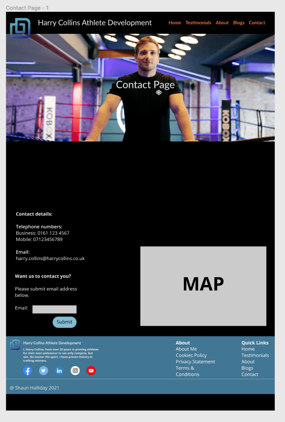
The site was built using HTML5 and CSS3 (via Sass pre-processing), and this was supplemented via Javascript to animate content via CSS and an API being pulled in for the Google Maps implementation in the contact area. As this was a single person build for a small brief agile methodology was employed throughout for the research, design, build, testing and deployment. A kanban board was used via Trello to keep a track of tasks throughout. Version control was used throughout the build process, using Git via Bitbucket. The responsive design methodology was employed through the use of media queries, used throughout the sass files to set different fonts, grids, flex containers and display settings dependent on the device breakpoints.
Testing, Validation and Deployment Stage
All the HTML was validated using the W3C validation service at validator.w3.org, to ensure standards were met in the HTML. Using the live server plugin in VS Code to run the site, accessibility testing was undertaken to resolve any issues that arose.
The site was deployed on the Netlify platform, bringing many benefits including a CDN that would hold the images and serve them quicker and more optimised. At this stage, the site was also tested with the browser tool Google Lighthouse to ensure the code/build is maximised for performance and usability.